Nike SP24 Running
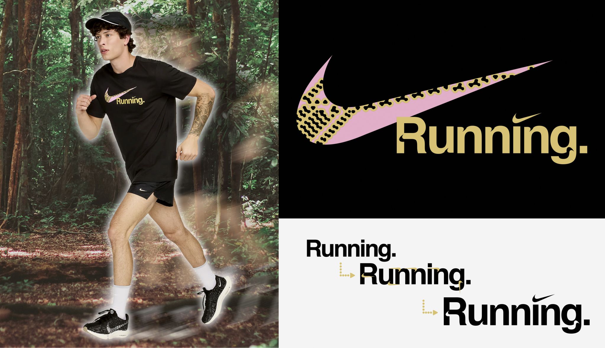
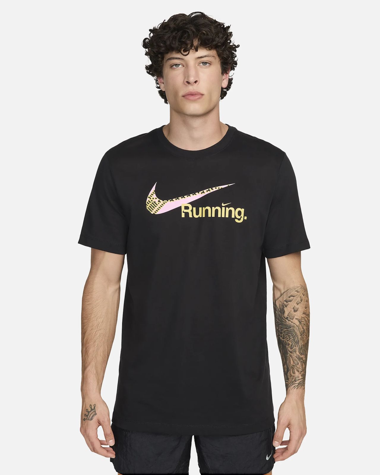
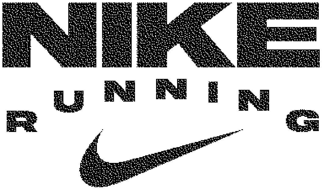
Art Direction, Design, Type DesignTasked with a few different directives this season, the first being a refresh on the classic “swoosh-running” tee, I wanted to add a twist by customizing the type with swoosh shaped ink-traps and filling the main logo read with an abstraction of our famed Pegasus shoe sole.
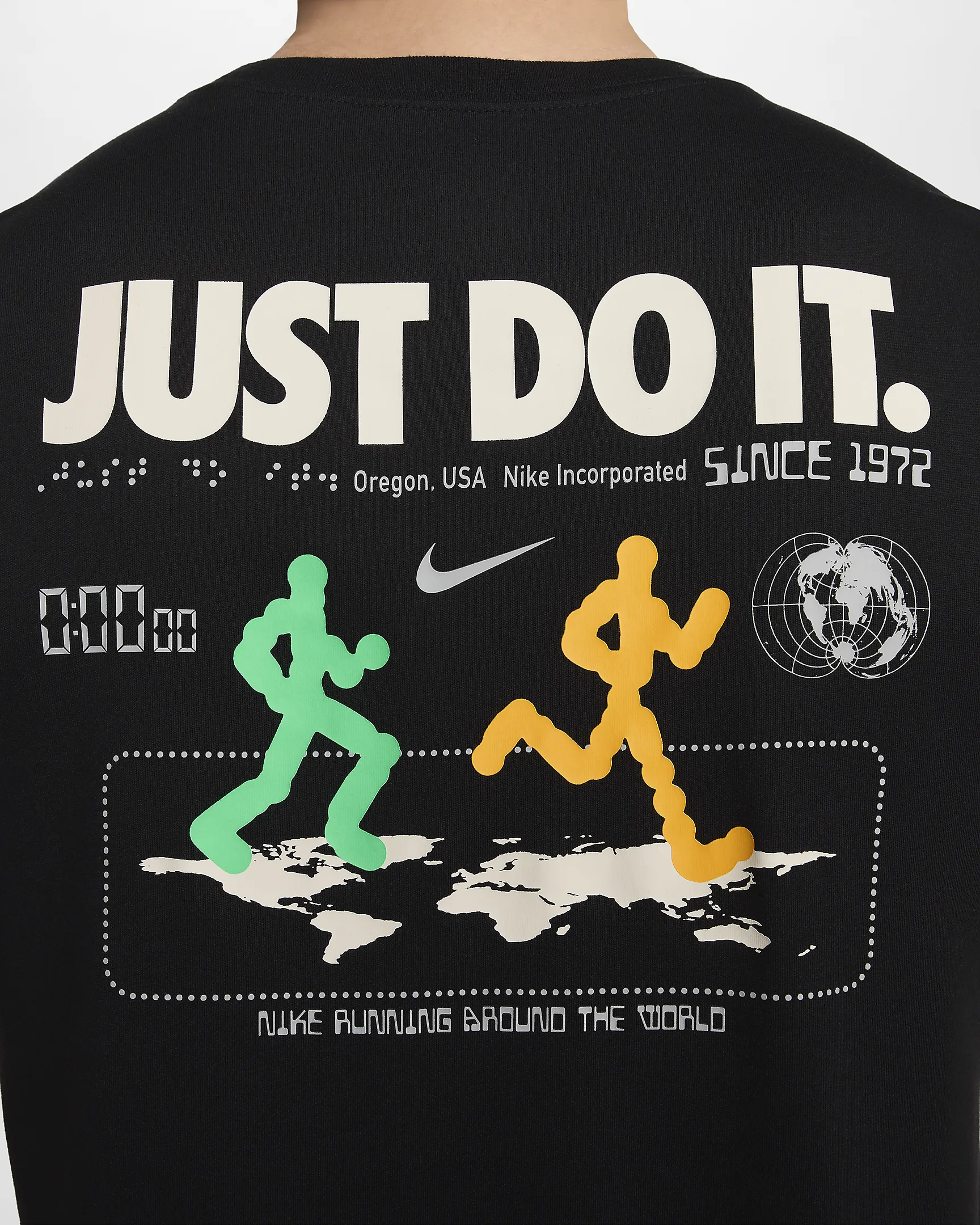
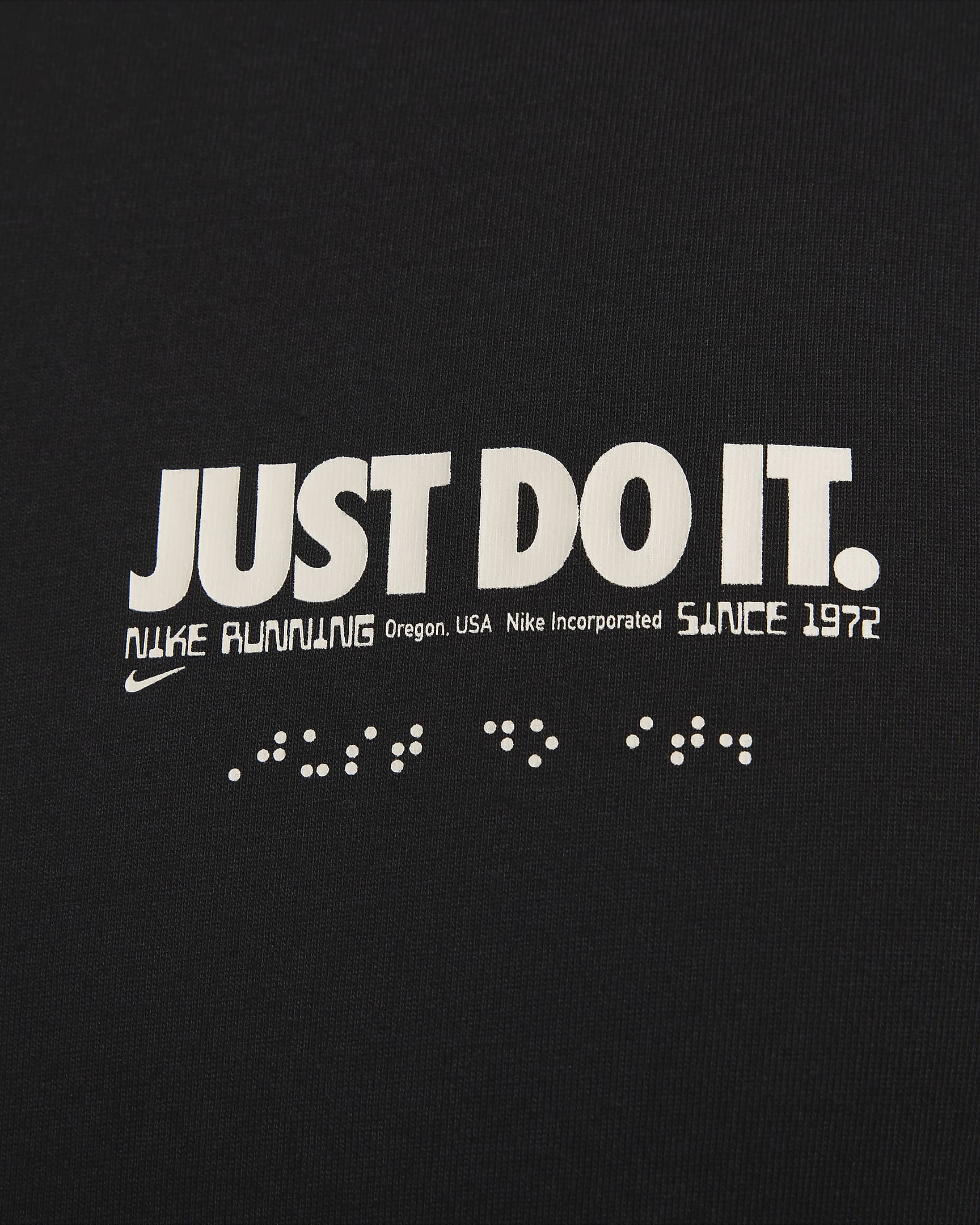
Next I created a tee that could operate as a sort of world tour tee, knowing the globe was too easy I wanted to picture runners running across the world, so I laid a flat map out and gave it perspective as well as created abstract figures to represent the various diverse runners of the world.
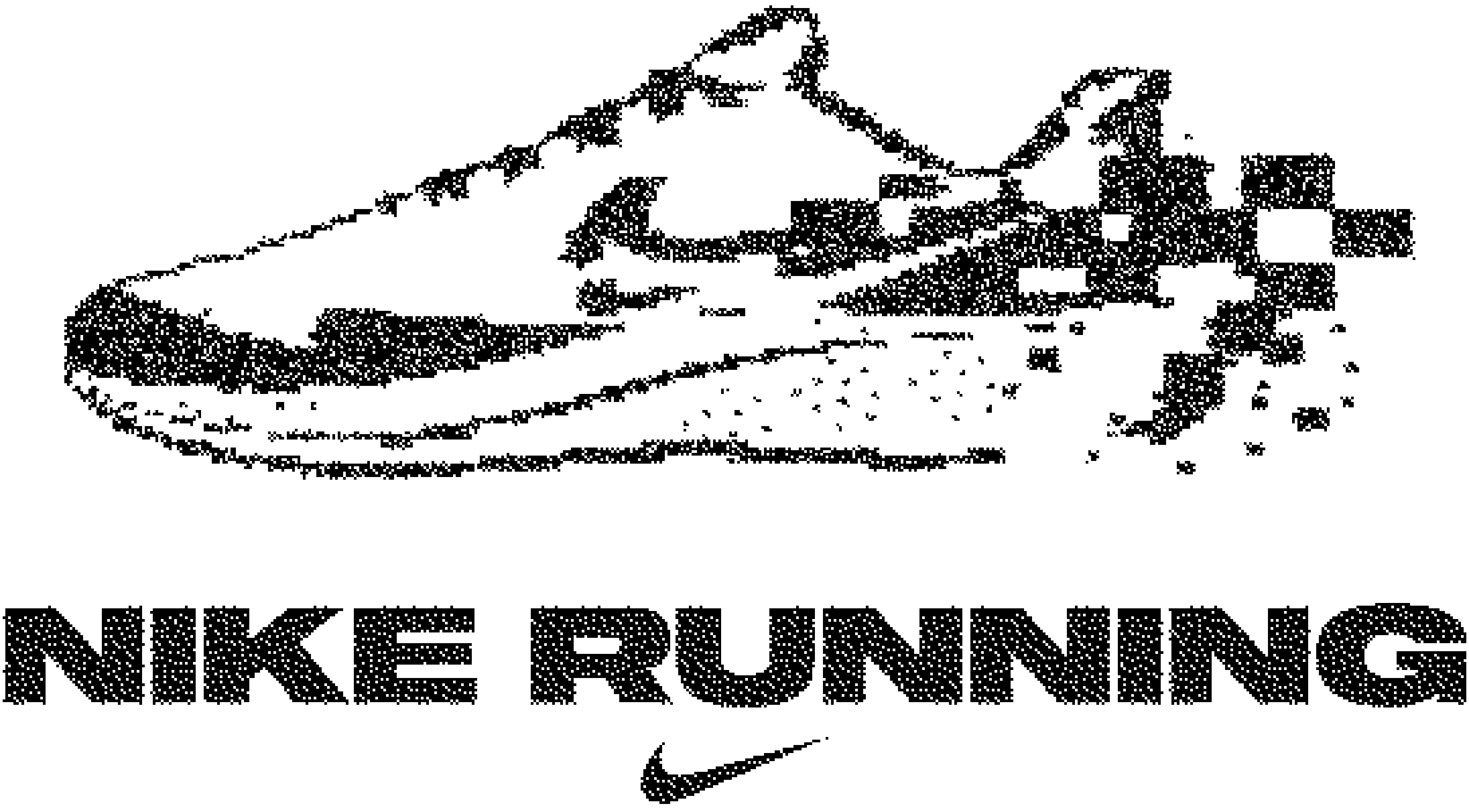
Lastly, we wanted to create a really simple tee that premiered the Pegasus and had a really digestible read for global consumers so I was inspired by the idea of footwear remixing a classic and thus added a dither and illustrated the shoe dematerializing at the hand of it’s own speed to denote quickness.